Emperor
(or Prince)
Scale of Colour
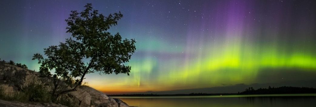
Yetzirah is the Formative World of Angelic consciousness (Choirs of Angels) corresponding to the element of Air and third letter in the tetragrammaton: Vav. It can also be thought of as the Astral World, as well the world of emotion and connection/ relationship. In Tarot, it is represented by the Knights and the suit of Swords.
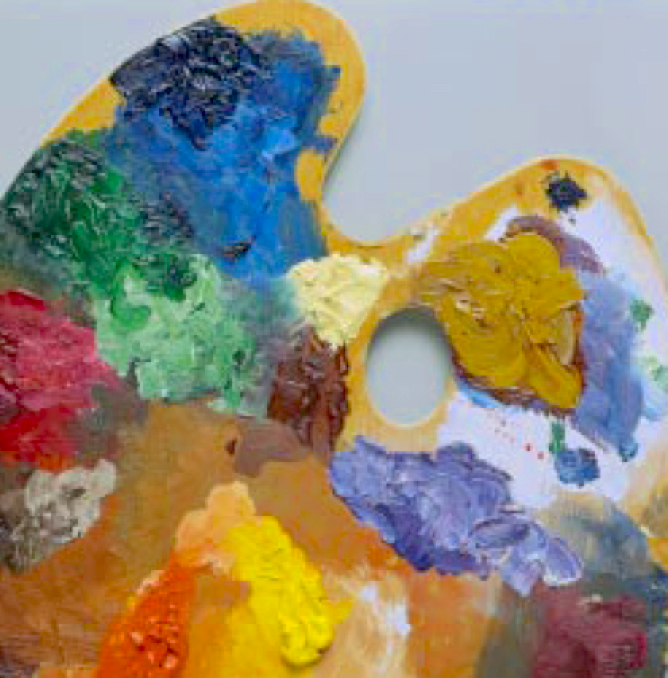
At this Level or World, how the colours were/are derived becomes a little less clear, although there is some sense in it. The Lecture on the Four Scales of Colour from the Whare Ra papers suggests that the colours in the scale are usually a blend of King Scale and Queen Scale colours.
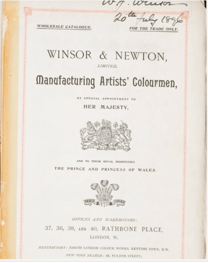
Bill Heindrick concurs in his 1977 lecture called The Rose and the Scales: “…The Emperor scale is a simple mixture of the colors in the King and Queen scales. There are one or two exceptions, but that is the basic method. For example, Bright Pale Yellow and Sky Blue mix to give a form of Green. Some of the names for these colors are a bit odd; e.g. blue-emerald-green and new yellow leather. Those names come from a color set available in the 1890’s and made by Winsor-Newton Ltd. Many of them are still sold as opaque water colors (WN Designers Gouche) in tubes. Some of the members of the Order of the Golden Dawn apparently insisted that certain colors were still being left out.”

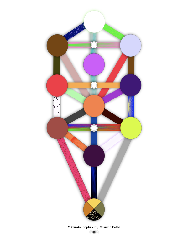
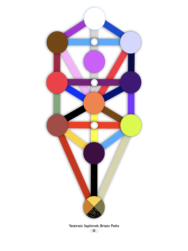
Another thing that’s interesting about the representation of colours in Yetzirah as described in the left column is the conceptual shift from the prismatic colours of light (additive colour mixing) in Atziluth and Briah to the physical representation of colour via pigments (subtractive colour mixing). The difference between these two is nicely described in the Krantz & Schwartz Interactive Sensation Laboratory Exercise linked above. It would also mean a shift from RGB colours to CMYK, I think.
Perhaps this touches on the differences between Newton and Goethe’s colour theory? Here’s a quick synopsis from Study.com: “Goethe disagreed with Newton. He refuted the idea that color was determined solely by light and the color spectrum, instead arguing that color was shaped by perception as well as elements of light and darkness. In these arguments, Goethe became one of the first people to systematically explore color and color theory, the study of how colors are perceived and how they interact with other colors. Unlike Newton, Goethe argued that color needed darkness, and some colors were made with elements of darkness. Here is how Goethe described it: ‘Light and darkness, brightness and obscurity, or if a more general expression is preferred, light and its absence, one necessary to the production of color . . . color itself is a degree of darkness.’
“Scientifically, Newton was right. But Goethe’s theories were more art and philosophy than pure science. And, if you think about it, there are differences between how color is created via the visible spectrum (where white is the combination of all colors) versus with pigments (where the more colors you mix together, the darker a color you get). In a way, it was pigments, or colors in paint, that led to Goethe’s color experiments, so it’s not surprising his ideas differed from those of Newton.”
The above still doesn’t address is the concept of astral colours: how these are all perceived with inner vision. Perhaps we’ll see an astral colour wheel one of these days?